Whenever there’s a WordPress awards election, like the WP Awards or the Monster Awards, Bricks is always in the top 3 results.
That doesn’t mean Bricks is the most popular page builder for WordPress though; pagebuilders like Elementor and Divi have WAY more users.
But Elementor and Divi cater to a different audience, whilst Bricks focused on professional web builders / developers.
And it just so happens that only those professionals vote on these award elections.
So, even though these elections don’t mean Bricks is the most popular page builder for WordPress in general, it does show Bricks is very popular amongst professionals.
I’ve had a Bricks license for years already, but I’ve only built one or two website with it. That because I prefer another page builder called Greenshift.
In this article, I explain why.
Bricks and Greenshift – What do they have in common?
Well, quite a lot actually 🙂 Both Bricks and Greenshift:
- Are class first builders
- Support the use of tokens / variables
- Allow you to set default styles for all blocks / elements
- Have a centralized global class & variables manager
- Have global color palets on which you can add unlimited colors
- Fully support CSS grid and flexbox, with all possible controls
- Offer CSS filters & transform effects
- Offer gradients
- Offer animations
- Offer interactions
- Offer styling controls for pseudo classes like hover, active and focus
- Output clean code and score well on Google’s Core Web Vitals
- Offer really extensive styling options
- Have customizable breakpoints
- Support globally synched reusable blocks (Bricks calls those “global elements”)
- Will soon have true component functionality
- Have conditions
- Have a popup builder
- Have a sliding panel / offcanvas builder
- Have an extensive code block available
- Have Core Framework integration (which is free for Greenshift, vs a paid addon for Bricks)
- Offer extensive support for dynamic data
- Have an advanced query loop builder
- Let you set which HTML tag you want to use
- Let you add aria labels
- Offer image masks (both presets and custom svg’s)
- Offer WooCommerce blocks / elements to customize your product loops, single product page, cart page, account page, checkout page etcetera
- And probably a lot more that I forget to mention here
Why I prefer Greenshift over Bricks
Greenshift's user interface is way more visual
This is the main reason I prefer Greenshift over Bricks, and also the main reason why the transition from Divi to Greenshift was so smooth for me.
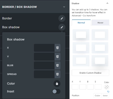
Let’s take shadows as an example. As you can see in the image, In Bricks, you’ll have to add the values for your shadows manually. In Greenshift, there are 6 presets, that you can refine if you want to. If you want to, you can set all the values for your shadows manually in Greenshift too, but you don’t have to.
The same goes for things like border-radius and gradients. Also, things like shape dividers and image masks just have an image of the divider or mask, instead of (only) it’s name like in Bricks.
Is an image to big? You can just drag it to resize it. Same for border radius. Or absolute position any element by dragging it to wherever you want it (for each breakpoint so it’s not a total disaster on mobile).
And there’s a visual CSS grid builder, so you can drag & drop your bento grid exactly the way you want it.
You can use CSS grid in Bricks too of course, but there’s no real user interface for it, apart from some fields for gaps and stuff. You’ll have to input the code for the grid itself manually. Which you can do in Greenshift as well if you prefer that, but again, you don’t have to.
Greenshift is a Gutenberg addon
Gutenberg is the core editor in WordPress, and it comes with a good number of standard blocks for things like normal text, headings, images, buttons. It also has a row block for layout building (which utilizes flexbox) and a CSS grid block which is in beta at the moment. However, core Gutenberg block offer very little (styling) options
Gutenberg addons like Greenshift add their own versions of those blocks, but with way more (styling) options and other features. And of course, also dozens of new blocks that aren’t available in the core version of Gutenberg.
A BIG advantage of using Gutenberg is that you can mix & match blocks. So I can use the CSS grid block from Greenshift to build my layout, and put core Gutenberg paragraph and image blocks inside that. followed by a Greenshift button block. Or a button block from another block plugin like Kadence, Spectra or Stackable. Or any other block from a Gutenberg compatible plugin…
And since Gutenberg is the standard WordPress editor, there are a LOT of those. And, almost everything in Gutenberg is nestable.
In Bricks (and Elementor, and Divi) you can only add third party blocks that are especially made for that specific builder.
Greenshift also has it’s own (free) FSE theme, which utilizes the latest WordPress technology. FSE is an abbreviation for Full Site Editing,
which means you can build every part of your site with blocks; your header, footer, single post or page templates, WooCommerce templates,
404 page… everything.
Greenshift gives WooCommerce superpowers...
Both Bricks and Greenshift offer everything you need to build custom product loops / archives, single product pages, cart page, checkout, my account page etcetera.
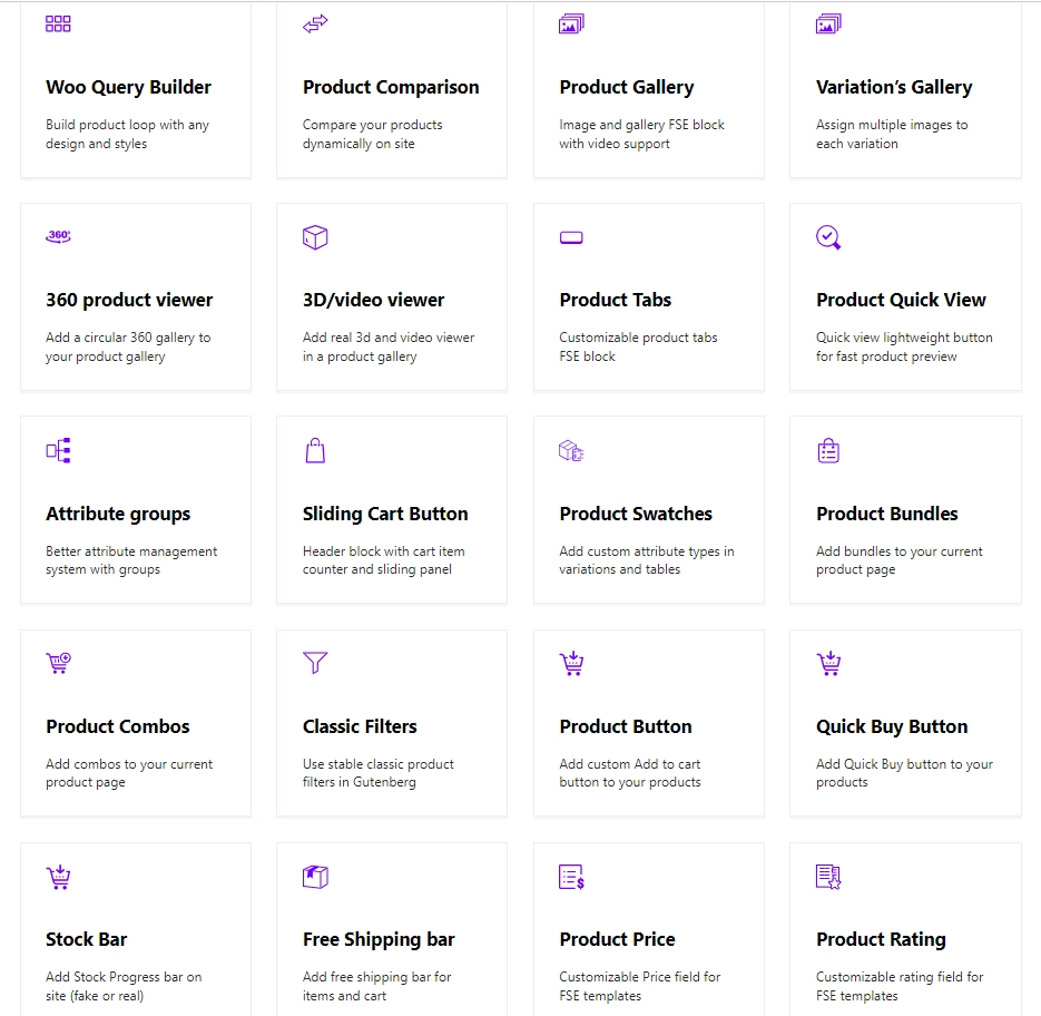
However, Greenshift offers a good number of additional blocks and functionality, like:
- Quick view
- Wishlist
- Product comparison
- Free shipping bar (add x more to get free shipping)
- Variation gallery (add multiple images for a variation of a variable product)
- 360 and 3D product viewer
- Product swatches
- Product bundles and combos (you can set a discounted price)
- Custom product tabs
- Quick buy button to redirect user to checkout immediately
And animations too!
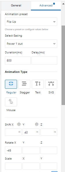
You can set entry animations in Bricks via the interactions panel, but it’s way easier and way more powerful in Greenshift,
especially if you have the animation addon. That adds he GSAP animation library, which is also used in the popular motion.page.
In Bricks, you can only choose from a few dozen presets, but you can’t tweak those much.
You can set how long the animation should run, set a delay, and if you want the animation to run only once or continuously.
In Greenshift, you can also select a preset, but you can tweak that any way you want to. You like the flip effect, but want it
to rotate 90 degrees on the Y-axis as well? You can do that. Add a scaling effect to it? No problem. The same goes for opacity,
skew, x and y translate etcetera.
The animation addon also adds different animation types, like stagger (inner blocks get animated with a delay between each block, without having to set that for each inner block), text animations (like show letters one by one), SVG drawing, and mouse interaction effects.
Of course, you can also choose the trigger you want to use; on load for simple entrance animations, but you can also use scroll effects or use an “observer” like hover, click, drag or press. You can even set a custom trigger and chain multiple animations.
Also, the animation addon add a number of blocks to your collection, like a real parallax background (not just fixed position), Lottie, Rive, Apple style image and video effects etcetera. All with smart loaders so they won’t affect your pagespeed score.
Turn anything in a carousel, on mobile only or on desktop as well
Carousels are another super power of Greenshift; you can turn anything into a horizontal (or vertical) scrollable carousel. You can even choose if you want that to happy only on mobile, or on desktop as well. For example, you can have 6 testimonials in a grid on desktop, and have them as a carousel on mobile with just one click.
Development goes crazy fast
Development is a bit more ad-hoc than that of Bricks; Greenshift does have a roadmap and a feature request board, but features aren’t necessarily added in that order.
Figma to Greenshift plugin
One of the latest features is a Figma to Greenshift plugin. Whilst still in beta, it should automatically convert Figma designs to Greenshift blocks.
Why you might prefer Bricks
Bricks is NOT a Gutenberg addon
Earlier, I mentioned a number of advantages of Gutenberg. But as with everything, there are some disadvantages as well. For one, Gutenberg is a backend builder,
in which the design doesn’t always look exactly the same as in the front-end.
But a lot of people just hate Gutenberg for numerous reasons. The Gutenberg plugin, which gives you access to new features months before they’re added in WordPress core, has a rating of 2/5 stars, and the classic editor plugin which disables Gutenberg on your site has over 5 million active installs.
Addons, templates and tutorials
Bricks has a large ecosystem / community around it. There are dozens of addons for Bricks available, as well as a number of templates libraries (that’s a weak point in Greenshift; they do have a template library but it’s way too small at the moment).
Next to that, you can find a LOT of (video) tutorials for Bricks, WAY more than for Greenshift at the moment. Documentation is still a weak point of Greenshift too,
even though that already has improved dramatically in the past year or so.
Automatic CSS (ACSS) support
Automatic CSS is a CSS framework which makes it easy to keep your styling consistent and maintainable. Even though both Greenshift and Bricks support Core framework, which is another CSS framework, but ACSS is by far the most popular option under Bricks users.
PS ACSS is founded by Kevin Geary, who’s YouTube channel I highly recommend.
Unlimited custom breakpoints
Even though Greenshift has customizable breakpoints, they’re limited to 4 breakpoints at the moment. In 99% of the cases, that’s all you’ll need, but Bricks lets you set an unlimited amount of breakpoints.
Font Awesome integration
Bricks has integrated icon libraries like Font Awesome. Greenshift only has a few dozen basic icons by default, which is a conscious choice – they don’t want to add any external dependencies that might slow your site down.
However, you CAN use custom SVG code in Greenshift. Font Awesome let’s you copy the SVG code for any icon really easy, but it is an extra step.
Bricks has built-in facet filters and a form block
Those are on the roadmap for Greenshift as well, but at the moment, they only offer very basic filters.
So, over to you!
Let me know in the comments below!
Need help with your website?
This article is written by Bob the webbuilder, an allround website expert who blogs regularly about all kinds of subject to help you build your website. Do you need help?
Hire Bob to build your website or improve your existing website.
Related Posts
 Cwicly was a popular Gutenberg addon amongst professionals. Indeed, it WAS, because sadly, the development of Cwicly is discontinued, leaving many users searching for a worthy alternative. Is Greenshift the answer? Let's find out!
- I've been building websites almost exclusively in Divi for years, but lately, I've switched to Greenshift. Want to know why? In this article, I'll tell you exactly why I prefer Greenshift nowadays, but also what Divi (still) does better.
